Histograms of grouped data
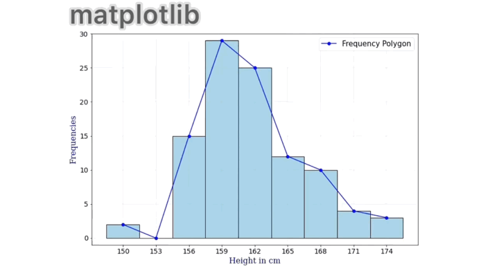
matplotlib
import numpy as np
import seaborn as sns
from matplotlib import pyplot as plt
from matplotlib import markers as marks
%matplotlib inline
#Data
heights = np.array([150,153,156,159,162,165,168,171,174])
freq = np.array([2,0,15,29,25,12,10,4,3])
class drawdata:
    def __init__(self,values,frequencies,xaxname,yaxname,
                fig,ax):
        self.x = values
        self.y = frequencies
        self.xaxname = xaxname
        self.yaxname = yaxname
        self.fig = fig
        self.ax = ax
    def drawfreq(self,showmean=False,showstd=False):
        self.mean_val = np.sum(self.x*self.y)/np.sum(self.y)
        variance = np.sum((self.x-self.mean_val)**2*self.y)/np.sum(self.y)
        self.sd_val = np.sqrt(variance)
        self.font = {'family': 'serif',
        'color':  'darkblue',
        'weight': 'normal',
        'size': 16,
        }
        self.ax.grid(linewidth=0.2)
        self.ax.bar(heights,freq,width=3,linewidth=1,
                    edgecolor='black',tick_label=heights,color='lightblue')
        self.ax.set_xlabel(self.xaxname,size=16,fontdict=self.font)
        self.ax.set_ylabel(self.yaxname,size=16,fontdict=self.font)
        self.ax.plot(self.x,self.y,'o-',color='blue',
                     label='Frequency Polygon')
        self.ax.tick_params(axis='both', labelsize= 14)
        if showmean:
            print('Mean value:', self.mean_val)
            self.ax.set_ylim((-1,max(self.y)+1))
            self.ax.plot(self.mean_val,0,marker=r'$\odot$',markersize=15,
                     color='red',linestyle='None',label='Mean')
        if showstd:
            print('Standard deviation (S.D.):', self.sd_val)
            def stdmargins(sd=self.mean_val, linewidth=4, label=None):
                self.ax.axvline(x=sd,color='black',alpha=0.7,
                            linestyle='-.',linewidth=linewidth,label=label)
            stdmargins(label = 'Axis thorugh mean')
            stdmargins(self.mean_val+self.sd_val,linewidth=2,
                       label="One S.D. away \n from axis")
            stdmargins(self.mean_val-self.sd_val,linewidth=2)
            stdmargins(self.mean_val+2*self.sd_val,linewidth=1,
                       label="Two S.D. away \n from axis")
            stdmargins(self.mean_val-2*self.sd_val,linewidth=2)
        handles, labels = self.ax.get_legend_handles_labels()
        d = dict(zip(labels,handles))
        uniqlabels = list(d.keys())
        handles = [d[i] for i in uniqlabels]
        self.ax.legend(handles,uniqlabels,loc=1,prop={'size': 15},
                      framealpha=0.5)
from celluloid import Camera
fig, ax = plt.subplots(figsize=(12,8))
camera = Camera(fig)
datafigs = drawdata(heights,freq,'Height in cm','Frequencies',fig,ax)
args = [{'showmean':False},{'showmean':True},
       {'showmean':True,'showstd':True}]
for i in args:
    datafigs.drawfreq(**i)
    camera.snap()
animation = camera.animate(interval=1200)
animation.save('my_matplotlib.gif', writer = 'imagemagick')
ggplot2
library('ggplot2')
library('gganimate')
heights <- c(150,153,156,159,162,165,168,171,174)
freq <- c(2,0,15,29,25,12,10,4,3)
drawdata <- setRefClass("drawdata",fields = list(values = "numeric", freqs = "numeric",
                                               xaxname="character",yaxname="character",
                                                showmean="logical",showstd="logical",
                                                 movie="logical"),
                     methods=list(
                         draw_freq = function(){
                             df <- data.frame(rep(values,times=freqs))
                             #Plotting layer by layer
                             plyrs <- ggplot(data=df, aes(x=df[,1]),label.size=5) +
                                geom_histogram(binwidth = 3, fill = 'lightblue',
                                               colour = 'black') +
                                geom_freqpoly(binwidth = 3,colour = 'black',
                                             show.legend=TRUE, aes(linetype="Frequency \n Polygon")) +
                                scale_x_continuous(name = 'Height', breaks = values,labels = values,
                                                   limits = c(min(values)-unique(diff(values))/2,
                                                              max(values)+unique(diff(values))/2)) +
                                scale_y_continuous(name = 'Frequencies',breaks = seq(min(freq),max(freq),2),
                                                labels=seq(min(freq),max(freq),2))+
                                theme(axis.text=element_text(size=20),
                                   axis.title=element_text(size=24,face='bold'),
                                     legend.title = element_blank(),
                                     legend.text=element_text(size=15),
                                     legend.position="top",
                                     legend.key.size = unit(3,"line"),
                                     )+
                             guides(fill = guide_legend(override.aes = list(linetype = 0))
                                    )
                             if (showmean){
                                 plyrs <- plyrs +
                                     geom_point(aes(x=mean(df[,1]),y=0, fill='Mean'),shape=21,
                                                size=10)
                             }
                             if (showstd){
                                 stdev <- sqrt(sum((df[,1]-mean(df[,1]))^2)/length(df[,1]))
                                 plyrs <- plyrs +
                                 geom_vline(aes(xintercept = mean(df[,1]),size='a'),
                                            linetype='dotdash') +
                                 geom_vline(aes(xintercept = mean(df[,1])+stdev,size='b'),linetype='dotdash') +
                                 geom_vline(aes(xintercept = mean(df[,1])+2*stdev,size='c'),
                                            linetype='dotdash') +
                                 geom_vline(aes(xintercept = mean(df[,1])-stdev,size='b'),
                                            linetype='dotdash') +
                                 geom_vline(aes(xintercept = mean(df[,1])-2*stdev,size='c'),
                                            linetype='dotdash') +
                                 scale_size_manual(breaks=c('a','b','c'),values=c(2,1,0.5),
                                                   labels=c('Axis through \n mean',
                                                            'One S.D. away \n from mean',
                                                            'Two S.Ds away \n from mean'))

                             }
                             if (movie){
                                 plyrs <- plyrs + transition_layers(
                                      layer_length = 1,
                                      transition_length = 1,
                                      keep_layers = TRUE,
                                      from_blank = TRUE,
                                      layer_order = NULL,
                                      layer_names = NULL)
                             }
                             return(plyrs)
                             }))
s <- drawdata(values=heights,freqs=freq,
              xaxname = "Height in cm", yaxname = "Frequencies",showmean=TRUE,showstd=TRUE,movie=FALSE)
animate(s$draw_freq(), nframes=30, height = 600, width =1000)
anim_save('mygif_ggplot2.gif')
plotly
import plotly.graph_objects as go
import numpy as np
#Data
heights = np.array([150,153,156,159,162,165,168,171,174])
freq = np.array([2,0,15,29,25,12,10,4,3])
class drawdata:
    def __init__(self,values,frequencies,xaxname,yaxname):
        self.x = values
        self.y = frequencies
        self.xaxname = xaxname
        self.yaxname = yaxname
    def drawfreq(self):
        self.mean_val = np.sum(self.x*self.y)/np.sum(self.y)
        self.std = np.sqrt(np.sum(self.y*(self.x-self.mean_val)**2)/np.sum(self.y))
        self.fig = go.Figure()
        self.fig.update_layout(xaxis_title=self.xaxname,
                               yaxis_title=self.yaxname,
                               font = dict(size=20),
                               xaxis = dict(tick0 = 150,dtick=3,
                                            range=(min(self.x)-max(np.diff(self.x)),
                                                   max(self.x)+max(np.diff(self.x))),
                                           tickwidth=20, tickfont=dict(size=20)),
                              yaxis = dict(tickfont=dict(size=20),
                                           range=(-5,max(self.y)+5)))
        return self.fig
datafigs = drawdata(heights,freq,'Height in cm','Frequencies')
f = datafigs.drawfreq()
mean = datafigs.mean_val
std = datafigs.std
f.add_trace(go.Bar(x=heights,y=freq, width=3,
                   marker_color='blue',showlegend=False))
f.add_trace(go.Scatter(mode="markers",
           x=[mean],y=[0],visible=False,
           marker_symbol="circle-dot",marker_size=20,
           marker_line_width=2,marker_color="lightskyblue",
           name="Mean"))
Line1 = [dict(type="line",
              x0=mean,y0=0,x1=mean,y1=1,
              xref = "x",yref="paper",
              opacity = 0.5,
              line=dict(width=3,
                dash="dashdot"))]
Line2 = [dict(type="line",
              x0=mean+std,y0=0,x1=mean+std,y1=1,
              xref = "x",yref="paper",
              opacity = 0.5,
              line=dict(
                width=2,
                dash="dashdot")),
        dict(type="line",
              x0=mean-std,y0=0,x1=mean-std,y1=1,
              xref = "x",yref="paper",
              opacity = 0.5,
              line=dict(
                width=2,
                dash="dashdot"))]
Line3 = [dict(type="line",
              x0=mean+2*std,y0=0,x1=mean+2*std,y1=1,
              xref = "x",yref="paper",
              opacity = 0.5,
              line=dict(
                width=1,
                dash="dashdot")),
        dict(type="line",
              x0=mean-2*std,y0=0,x1=mean-2*std,y1=1,
              xref = "x",yref="paper",
              opacity = 0.9,
              line=dict(
                width=1,
                dash="dashdot"))]
button_list=[dict(label="Reset", method='update',
                    args=[{"visible": [True, False]},
                        {'shapes':[]}]),
            dict(label="Mean", method='restyle',
                    args=[{'visible':[True, True]},
                          {'showlegend':True},[1]]),
            dict(label="Axis of 2nd moment", method='relayout',
                    args=['shapes',Line1]),
            dict(label="1 Std. Deviation", method='relayout',
                    args=['shapes',Line2]),
            dict(label="2 Std. Deviations", method='relayout',
                    args=['shapes',Line3]),
            dict(label="Show All", method='update',
                    args=[{'visible':[True, True]},
                        {'shapes':Line1+Line2+Line3}])]

f.update_layout(updatemenus=[dict(type="buttons",
                                  direction="right",
                                  active=0,
                                  x=1,
                                  y=1.2,
                                  font={'size':10},
                                   buttons=button_list)])
import dash
import dash_core_components as dcc
import dash_html_components as html

app = dash.Dash()
app.layout = html.Div([
    dcc.Graph(figure=f)])

app.run_server(debug=True, use_reloader=False)
Running on http://127.0.0.1:8050/…